지난 포스팅에서 메인 Activity까지 확인하였습니다.
이번 포스팅은 메인 Activity에서 실행되는 Fragment의 Navigation에 대해서 분석해보겠습니다.
메인 Activity의 FragmentContainerView의 nav_garden 그래프에서 시작 Fragment로 등록되어있는 view_pager_fragment 아이디를 갖는 HomeViewPagerFragment를 확인해보겠습니다.

HomeViewPagerFragment
레이아웃 먼저 확인해 보았습니다.
<!--
  ~ Copyright 2018 Google LLC
  ~
  ~ Licensed under the Apache License, Version 2.0 (the "License");
  ~ you may not use this file except in compliance with the License.
  ~ You may obtain a copy of the License at
  ~
  ~     https://www.apache.org/licenses/LICENSE-2.0
  ~
  ~ Unless required by applicable law or agreed to in writing, software
  ~ distributed under the License is distributed on an "AS IS" BASIS,
  ~ WITHOUT WARRANTIES OR CONDITIONS OF ANY KIND, either express or implied.
  ~ See the License for the specific language governing permissions and
  ~ limitations under the License.
  -->
  <layout
    xmlns:android="http://schemas.android.com/apk/res/android"
    xmlns:app="http://schemas.android.com/apk/res-auto">

    <!--
     Note: even though the IDs for the CoordinatorLayout and the AppBarLayout unused in HomeViewPagerFragment, they are
     both required to preserve the toolbar scroll / collapse state when navigating to a new screen and then coming back.
    -->
    <androidx.coordinatorlayout.widget.CoordinatorLayout
        android:id="@+id/coordinator_layout"
        android:layout_width="match_parent"
        android:layout_height="match_parent"
        android:fitsSystemWindows="true">

        <androidx.viewpager2.widget.ViewPager2
            android:id="@+id/view_pager"
            android:layout_width="match_parent"
            android:layout_height="match_parent"
            app:layout_behavior="@string/appbar_scrolling_view_behavior"/>

        <com.google.android.material.appbar.AppBarLayout
            android:id="@+id/app_bar_layout"
            android:layout_width="match_parent"
            android:layout_height="wrap_content"
            android:fitsSystemWindows="true"
            android:theme="@style/Theme.Sunflower.AppBarOverlay">

            <com.google.android.material.appbar.CollapsingToolbarLayout
                android:id="@+id/toolbar_layout"
                android:layout_width="match_parent"
                android:layout_height="wrap_content"
                app:layout_scrollFlags="scroll|snap"
                app:toolbarId="@id/toolbar">

                <com.google.android.material.appbar.MaterialToolbar
                    android:id="@+id/toolbar"
                    style="@style/Widget.MaterialComponents.Toolbar.Primary"
                    android:layout_width="match_parent"
                    android:layout_height="?attr/actionBarSize"
                    app:contentInsetStart="0dp"
                    app:layout_collapseMode="parallax">

                <TextView
                    android:layout_width="match_parent"
                    android:layout_height="?attr/actionBarSize"
                    android:gravity="center"
                    android:text="@string/app_name"
                    android:textAppearance="?attr/textAppearanceHeadline5" />

                </com.google.android.material.appbar.MaterialToolbar>

            </com.google.android.material.appbar.CollapsingToolbarLayout>

            <!-- Override tabIconTint attribute of style with selector -->
            <com.google.android.material.tabs.TabLayout
                android:id="@+id/tabs"
                style="@style/Widget.MaterialComponents.TabLayout.Colored"
                android:layout_width="match_parent"
                android:layout_height="?attr/actionBarSize"
                app:tabIconTint="@drawable/tab_icon_color_selector"
                app:tabTextColor="?attr/colorPrimaryDark"/>

        </com.google.android.material.appbar.AppBarLayout>

    </androidx.coordinatorlayout.widget.CoordinatorLayout>

</layout>
CoordinatorLayout을 최상단 부모 View로 사용하고 있습니다.
CoordinatorLayout이란
FrameLayout에 기반을 둔 Layout으로 2가지 특징이 있습니다.
1. 최상위의 뷰로써 사용
2. 자식 뷰들 간의 상호작용 기능을 수행
ViewPager2가 있는데 layout_behavior가 적용되어있다.
적용된 behavior는 'com.google.android.material.appbar.AppBarLayout$ScrollingViewBehavior'이다.
구글 문서의 설명은 아래와 같다.
Behavior which should be used by Views which can scroll vertically and support nested scrolling to automatically scroll any AppBarLayout siblings.
수직 스크롤과 중첩된 스크롤 지원이 가능하도록 하는 행동이라고 예상된다.
AppBarLayout은 AppBarOverlay Theme을 가지며 하위에 CollapsingToolbarLayout이 존재한다.
AppBarLayout | Android 개발자 | Android Developers
developer.android.com
- app bar 디자인을 구현할 수 있는 Vertical LinearLayout이다.
- 하위 View들에게 app:layout_scrollFlags 기능을 제공하는데, 스크롤 동작을 제어할 수 있다.
- CoordinatorLayout에 매우 의존적으로 사용되며, 다른 ViewGroup 하위에 위치한다면 동작 이상이 있을 수 있습니다.
- 스크롤링 동작을 지원한다면 Behavior를 등록해야 합니다.
CollapsingToolbarLayout
CollapsingToolbarLayout은 AppBarLayout의 child로 사용해야 합니다.
CollapsingToolbarLayout은 scrollFalgs 속성으로 scroll과 snap을 갖습니다.
- scroll : 스크롤 이벤트가 있는 View에 적용해주어야 한다.
- snap : 아래로 스크롤시 Toolbar가 사라지고 다시 위로 스크롤하여 최상단에 위치하게되면 나타납니다.
- 그 외 속성들 + layout_collapseMode와 함께 사용(추후에 포스팅으로 다룰 예정입니다.)
- enterAlways
- enterAlwaysCollapsed
- exitUntilCollapsed
또한 속성으로 Toolbar ID를 명시하였습니다.
- app:toolbarId="@id/toolbar"
- 위처럼 id를 설정하면 어떤 toolbar를 사용할지 시각적으로 명시하게 됩니다.
- 그러나 위처럼 사용하지 않아도 CollapsingToolbarLayout 내부의 child view에 toolbar가 있을경우 내부에서 알아서 찾을 수 있습니다.
MaterialToolbar가 있습니다.
속성으로는 layout_collapseMode가 사용되었습니다.
- MaterialToolbar는 Material 특징을 갖는 Toolbar입니다.
- Dark Themes을 위한 elevation overlays를 사용할 수 있습니다.
- CollapsingToolbarLayout의 scrollFlags로 scroll과 snap을 설정한 상태에서 layout_collapseMode를 parallax로 설정하게 되면 스크롤 시 AppBarLayout의 내용은 가려지고 다시 살짝 위로 올리면 toolbar가 보였다가 완전히 위로 스크롤하게되면 AppBarLayout이 열리게된다.
- 이 프로젝트에는 아래로 스크롤 시 tabLayout만 보이고 toolbar는 가려지고, 위로 스크롤시 최상단에 도착하게되면 toolbar가 열리게 된다.
- style이 설정되어 있습니다.
- view에 style을 설정하게되면, 해당하는 style에 설정되어있는 view의 속성들(ex. padding, margin, background ...)을 간단하게 설정할 수 있습니다.
- style은 @style/Widget.MaterialComponents.Toolbar.Primary이 설정되어 있습니다.
- 설정된 값은 아래와 같습니다.
<style name="Widget.MaterialComponents.Toolbar.Primary">
    <item name="android:elevation" ns2:ignore="NewApi">@dimen/design_appbar_elevation</item>
    <item name="android:background">?attr/colorPrimary</item>
    <item name="titleTextColor">?attr/colorOnPrimary</item>
    <item name="subtitleTextColor">@color/material_on_primary_emphasis_medium</item>
    <!-- Note: this theme overlay will only work if the style is applied directly to a Toolbar. -->
    <item name="android:theme">@style/ThemeOverlay.MaterialComponents.Toolbar.Primary</item>
  </style>
마지막으로 TabLayout이 있습니다.
style이 적용되어 있습니다.
- @style/Widget.MaterialComponents.TabLayout.Colored
<style name="Widget.MaterialComponents.TabLayout.Colored">
    <item name="android:background">?attr/colorPrimary</item>
    <item name="tabIconTint">@color/mtrl_tabs_icon_color_selector_colored</item>
    <item name="tabIndicatorColor">?attr/colorOnPrimary</item>
    <item name="tabTextColor">@color/mtrl_tabs_icon_color_selector_colored</item>
    <item name="tabRippleColor">@color/mtrl_tabs_colored_ripple_color</item>
  </style>
tabIconTint의 속성으로 @drawable/tab_icon_color_selector가 적용되어있다.
- 탭을 선택했을 때 아이콘의 색상을 간단하게 변경할 수 있습니다.
- tab_icon_color_selector의 내부를 살펴보면 간단하게 이해할 수 있습니다.
<selector xmlns:android="http://schemas.android.com/apk/res/android">
    <item android:color="?attr/colorOnPrimary" android:state_activated="true" />
    <item android:color="?attr/colorPrimaryDark"/>
</selector>
다음은 클래스를 살펴보겠습니다.
/*
 * Copyright 2018 Google LLC
 *
 * Licensed under the Apache License, Version 2.0 (the "License");
 * you may not use this file except in compliance with the License.
 * You may obtain a copy of the License at
 *
 *     https://www.apache.org/licenses/LICENSE-2.0
 *
 * Unless required by applicable law or agreed to in writing, software
 * distributed under the License is distributed on an "AS IS" BASIS,
 * WITHOUT WARRANTIES OR CONDITIONS OF ANY KIND, either express or implied.
 * See the License for the specific language governing permissions and
 * limitations under the License.
 */
 package com.google.samples.apps.sunflower

import android.os.Bundle
import android.view.LayoutInflater
import android.view.View
import android.view.ViewGroup
import androidx.appcompat.app.AppCompatActivity
import androidx.fragment.app.Fragment
import com.google.android.material.tabs.TabLayoutMediator
import com.google.samples.apps.sunflower.adapters.MY_GARDEN_PAGE_INDEX
import com.google.samples.apps.sunflower.adapters.PLANT_LIST_PAGE_INDEX
import com.google.samples.apps.sunflower.adapters.SunflowerPagerAdapter
import com.google.samples.apps.sunflower.databinding.FragmentViewPagerBinding
import dagger.hilt.android.AndroidEntryPoint

@AndroidEntryPoint
class HomeViewPagerFragment : Fragment() {

    override fun onCreateView(
        inflater: LayoutInflater,
        container: ViewGroup?,
        savedInstanceState: Bundle?
    ): View? {
        val binding = FragmentViewPagerBinding.inflate(inflater, container, false)
        val tabLayout = binding.tabs
        val viewPager = binding.viewPager

        viewPager.adapter = SunflowerPagerAdapter(this)

        // Set the icon and text for each tab
        TabLayoutMediator(tabLayout, viewPager) { tab, position ->
            tab.setIcon(getTabIcon(position))
            tab.text = getTabTitle(position)
        }.attach()

        (activity as AppCompatActivity).setSupportActionBar(binding.toolbar)

        return binding.root
    }

    private fun getTabIcon(position: Int): Int {
        return when (position) {
            MY_GARDEN_PAGE_INDEX -> R.drawable.garden_tab_selector
            PLANT_LIST_PAGE_INDEX -> R.drawable.plant_list_tab_selector
            else -> throw IndexOutOfBoundsException()
        }
    }

    private fun getTabTitle(position: Int): String? {
        return when (position) {
            MY_GARDEN_PAGE_INDEX -> getString(R.string.my_garden_title)
            PLANT_LIST_PAGE_INDEX -> getString(R.string.plant_list_title)
            else -> null
        }
    }
}- @AndroidEntryPoint 어노테이션을 통해 Hilt 종속성 주입이 사용되었습니다.
- Hilt 종속성은 따로 다룰 예정입니다.
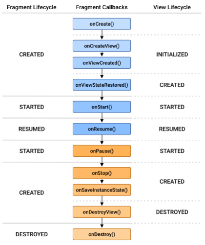
- Fragment에서 override 한 메서드는 View를 생성하기 위한 단계인 onCreateView() 함수만 사용되었습니다.
- Fragment의 생명주기는 아래와 같습니다.
- DataBinding을 통해 뷰를 inflate합니다.
- ViewPager의 adpater로 SunflowerPagerAdapter를 사용합니다. Adapter를 살펴보면 아래와 같습니다.
import androidx.fragment.app.Fragment
import androidx.viewpager2.adapter.FragmentStateAdapter
import com.google.samples.apps.sunflower.GardenFragment
import com.google.samples.apps.sunflower.PlantListFragment

const val MY_GARDEN_PAGE_INDEX = 0
const val PLANT_LIST_PAGE_INDEX = 1

class SunflowerPagerAdapter(fragment: Fragment) : FragmentStateAdapter(fragment) {

    /**
     * Mapping of the ViewPager page indexes to their respective Fragments
     */
    private val tabFragmentsCreators: Map<Int, () -> Fragment> = mapOf(
        MY_GARDEN_PAGE_INDEX to { GardenFragment() },
        PLANT_LIST_PAGE_INDEX to { PlantListFragment() }
    )

    override fun getItemCount() = tabFragmentsCreators.size

    override fun createFragment(position: Int): Fragment {
        return tabFragmentsCreators[position]?.invoke() ?: throw IndexOutOfBoundsException()
    }
}
FragmentStateAdapter 특징
- FragmentStateAdapter를 상속받고 있습니다.
- deprecated 되었던 FragmentStatePagerAdapter를 대체합니다.
- createFragment() 함수에서 2개의 탭을 생성함을 알 수 있습니다.
다시 fragment로 돌아가서.
TabLayoutMediator를 사용하여 TabLayout과 ViewPager2를 인자로 넣어주고 position에 맞게 icon, title을 설정한 뒤 attach() 함수를 이용해 TabLayout을 ViewPager2에 연결합니다.
그 뒤 setSupportActionBar() 함수를 이용해 actionBar로 toolbar를 명시해주고 root view를 return합니다.
여기까지 navigation 그래프의 view_pager_fragment를 확인하였습니다.
다음은 plant_detail_fragment를 검토해보겠습니다.
'Android > 꼼꼼한 리뷰' 카테고리의 다른 글
| [Sunflower] Main Activity 기능 확인해보기(Navigation, Hilt, DataBinding) (0) | 2020.12.30 |
|---|---|
| [Sunflower] Sunflower 프로젝트 살펴보기(using Jetpack) (0) | 2020.12.30 |


댓글